Skip to content
Veebitrendid 2021. aastal

Blog

Web trends in 2021

In addition to natural developments in trends, the dramatic year 2020 made us think about things that have otherwise been left behind in the capitalist race of progress.

Silver Sikk

25.12.2020

The ecological impact of the digital realm

Climate protests and eco-themes have also reached design. It’s a fact that digital infrastructure is a huge consumer of energy, and its appetite continues to grow. Storing and transmitting information requires energy. Global systems with billions of users emit tons of CO2 per minute, and if the Internet were a country, it would be the seventh largest polluter in the world.

How big is the impact of one web page? A single visit is absolutely harmless. But when the number of visits accumulates, there is already some effect. Test your web’s carbon emissions – that’s a pretty big number, isn’t it? So what can you do to reduce the environmental impact of your website?

Most importantly, use few images and especially video, because storing them and dragging them to the user’s device takes energy. The web should be as simple and text-based as possible. Or delete the web altogether if no one needs it. You can also save resources by optimising the code. Banners and user trackers of any kind are evil by default. Here are some more tips.

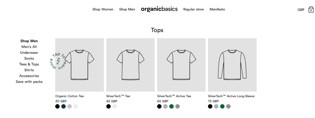
One example of a green extreme web is the Organic Basics online store. Product images, for example, are loaded if the user requests it separately by clicking on the button. Of course, the question always arises that in this case, keeping the green web and the regular web in parallel is really sustainable and not just a clever branding trick? But you have to start somehow.

Organic Basics

The lesson from the entire eco-topic could be that users actually like a fast and simple web, so an environmentally friendly web is good for everyone. We probably don’t really want a stingy web, but it’s good if there is awareness of the problem and someone avoids harmful exaggeration in some places.

Engagement

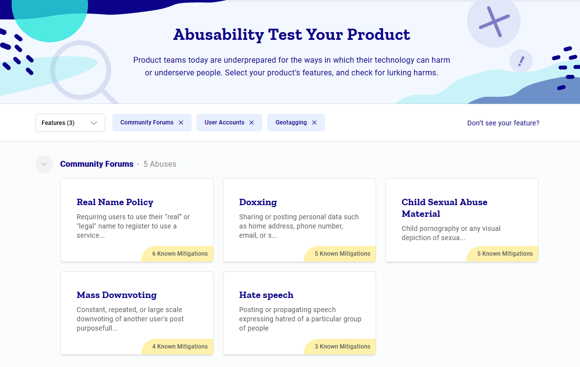
Especially in connection with the racial protests in the USA, the topics of ethics and inclusion in the field of design gained momentum. Technology is powerful and ideally good, but it can also lead to bullying, discrimination and is a good helper for dictators and other evildoers.

We have realised that Facebook is also responsible for the spread of malicious posts, and not just the malicious digital bully. But doesn’t your website or branding offend, discriminate or violate anyone’s privacy? How far to go with political correctness is a separate issue, but there is a problem. Awareness of this has resulted in, for example, an assistant for the owner of a digital product, which shows possible dangers and how to fix it:

Platformabuse

Accessibility

Accessibility is an increasingly important topic and we have also written about it on our blog. Everyone deserves access to digital services and content. The blind, for whom the screen is not enough; elderly people who have problems with clicking buttons with a mouse and seeing; children with more limited attention spans. But also a middle-aged model citizen, who may have a cast on their arm or a roomful of children interfering with their concentration or an intermittent internet connection:

Inclusive design persona spectrum

Again, an accessible web is also only good for all parties involved.

In the world of designers and developers, it is understood and the topic is important. In the European Union, accessibility is already written into the law. But as the statistics show, there is still no development on a global scale. For example, one of the main and simplest criteria, sufficient contrast of the text, is ensured by only 21% of the world’s websites, and the trend is downward.

How to start? The colour of the texts should contrast sufficiently with the background. Add alt descriptions to images for the visually impaired with a screen reader. Web texts should be as clear and short as possible – see instructions on our blog. A couple of tools to get you started quickly, fix even one bug and already some users’ lives are easier:

Visual trends

Content that is interesting to users, good usability and purposefulness make a website practical and good. But what makes it awesome? Here are some keywords.

Realism

User interfaces are once again becoming more spacious and realistic. Layers are used, photo, text, illustration, graphic elements are mixed. Objects cast realistic shadows and colour surfaces are often natural with a slight transition or texture. Often the elements have broken out of the strict layout to make the composition more lively or natural.

However, realistic does not mean complete realism – simply different elements, which may not be realistic at all, have been as if brought into the physical world. Here, for example, 3D and so-called normal illustration are mixed, things have shadows and the content block is as if in the same room as the illustration:

Illustration from designmodo.com

3D

Realism is associated with 3D, which has been a trend for the last couple of years. Since it is relatively difficult to produce, it has not conquered everything yet and seems relatively fresh and original. The popularity may be influenced by the fact that new simple 3D programs for UI design are coming, see for example Spline.

Neomorphism and frozen glass

In the circle of designers, the idea of ​​neomorphism was already being played with in 2019. Looks like 3D or plastic or rubber and is actually bad and confusing in terms of accessibility.

An example of neumorphism

Its actually usable sub-trend is the fogged and translucent, as if frozen glass effect, probably already familiar to iPhone users:

Frosen glass effect

Illustrations

Still popular, but the scene has diversified. Compared to the photo, the illustrations add more character. In addition to the retro-looking graphic illustration, you can also see a lot of 3D-based ones.

Rounded corners

It is almost everywhere, now even on Facebook, who changed its appearance completely. Everyone tries to look friendly.

Retro

Retro always works because people are nostalgic. Funky retro fonts of the 60s and 70s and soft colours bring friendliness and softness to today’s sometimes monotonous web.

90s animated gif

The 90s are the hype of the last few years. On the one hand, geek humour (Win95, gif-animations, Comic Sans font, etc.), on the other hand, rave-inspired, in-your-face energy with its big letters, raw colours, etc.

90s rave style

Colours

There are two Pantone colours of the year this time: lively lemon yellow and cement grey that stays in the background. In more comprehensive seasonal trends, Pantone offers fresh colours, broken and pastel shades.

Pantone 2021 colours

In reality, you can basically see two or three directions:

  • Bright colour transitions, mostly blue-red on a white background – technology themes, see image above for frosted glass effect.
  • Webs in broken tones or pastels sail on the retro trend – softer topics in commercial webs, culture, social affairs, law.
  • Raw primary colours, odd broken tones and colour palettes, monochrome and black and white – art and design.

Dark mode

The ability to choose a dark user interface in applications and the operating system is already the new normal, not a trend. Comfortable when used in a dark room and also saves battery on a device with an OLED screen. The solution that came with MacOS Big Sur works well, Windows is still pretty terrible. Quite often, a product has sometimes been made difficult to use with the dark transition.

Typography

The field is lively and rich, the creators are many and diverse.

Together with the geometric block typeface, the mild retro of the 70s, rich serif typefaces and display typefaces tending to exaggeration exist side by side for more experimental use.

Voyage - VJ-Type

The technical side of web design is affected by the wide spread of variable fonts – different thicknesses are now together in one small file, i.e. the page loads much faster. The ecological footprint is also smaller, right!?

Storytelling

Interactive infographics and storytelling are engaging. Game elements, augmented reality, etc. can be used to give an overview of a topic or place. Too often, unfortunately, the computer goes into a coma if a technically too demanding solution is used – so be careful not to overdo it with effects.

Immersive web

Brutalism

Bolder, mostly culture websites use a more experimental style instead of a smooth and cute commercial style, where the eye candy familiar from the mainstream is not primary. Here you can see unexpected, strange and playful colour combinations, effects, fonts, layout and navigation. If you’re looking for more experimental web design examples, check out www.hoverstat.es.

Movement, effects, transitions

Browsers are more and more capable, the code is more and more compact and smooth. It encourages the use of interesting and engaging animations and effects. Motion is an important feature of the real world, and it is increasingly seen online.

Content

Basically and finally, it must be mentioned that visual trends are cool, but the most important thing is still the content and purpose of the website or application. If it’s trendy but useless, it just takes up server space and energy and that’s it. To prevent this from happening, we first think and then create!

Further reading