Sinu terviklik digiturunduse partner
Sinu terviklik digiturunduse partner
Tervikliku digiturunduse teenused
Meie 360° lähenemine ühendab kõik digiturunduse võtmealad üheks tulemuslikuks tervikuks.


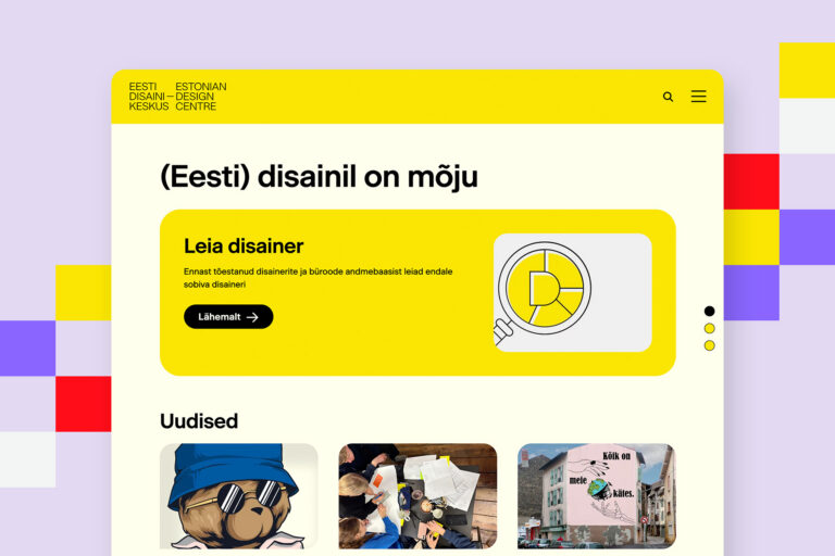
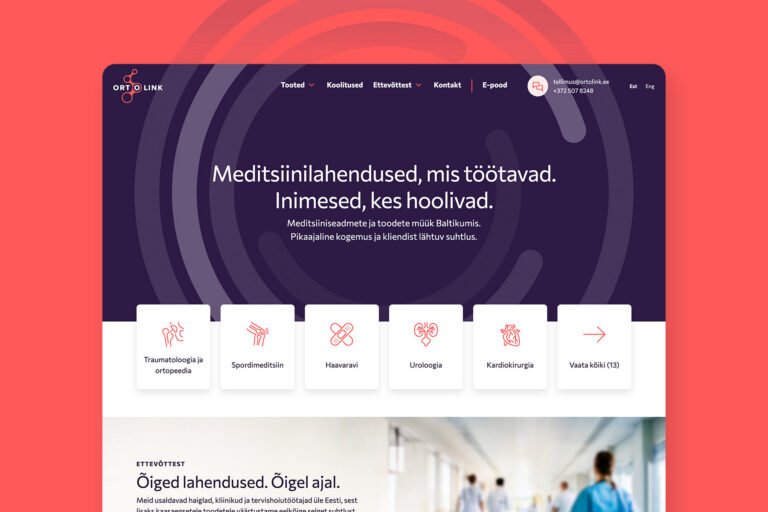
Tehtud veebiarenduse projektid


Redwall digiagentuur
Usaldage oma digimured meie hoolde.
300+tehtud projekti
0aastat kogemust
286+lemmikklienti
22548+joodud kohvi
Sinu
kontaktisikud
Redwallis

Digiteenuste juht Katre

Kasutajatoe juht Kadi
Redwalli kliendid
Meie portfellis on kümneid edukaid brände, veebilahendusi ja digikogemusi, mis kõnelevad iseenda eest.