The web is increasingly versatile and creative, just like in the early days of the internet. But what do the new technologies metaverse and web3 bring?
Silver Sikk
15.09.2022
Enthusiasm-based mini-webs
The web is again more and more diverse over the years. Precisely in the sense that who and for what puts up the website.
In general, it can be said that in the 90s and early 2000s, the web was still a sandbox of experiments, which was not as uniquely focused on business as it is today. The Internet as a marketing channel was still a rather foreign idea, and proportionally there were a lot of excitement-based websites: fan pages, private websites of the hello-this-is-my-website type and the like. When blogging environments came along, more individual self-expression was concentrated in blogs and later on in the endless chat chains of social media. What was left out were, above all, web-based services and websites created for marketing.
Since today there are several affordable web-building apps (e.g. Webflow, Readymag) that do not limit their use to templates and are flexible and simple enough to do anything, there is currently a small explosion of creativity on the Internet. Portfolios and art projects are made, experimental educational websites are put up, immersive mini-games, and just some weirdness.
People like storytelling and playfulness. Such websites are also favourites of design competitions. But they often turn your computer into a hovercraft, because they take the last out of the computer and its cooling system with their effects and animations. Such special websites definitely have their place.
Nostalgia and playing with the past still has its place. At the moment, design is shifting from the smooth idealism and psychedelia of the 60s and 70s to the more multi-layered and blurred world of the 80s and 90s.
You are even more on the cutting edge if you change the title to a grotesque font or Souvenir with narrow serifs from the 70s (ITC Garamond, Editorial New, etc.), add grain or paper texture to the photos, or use airbrush fake 3D for illustration instead.
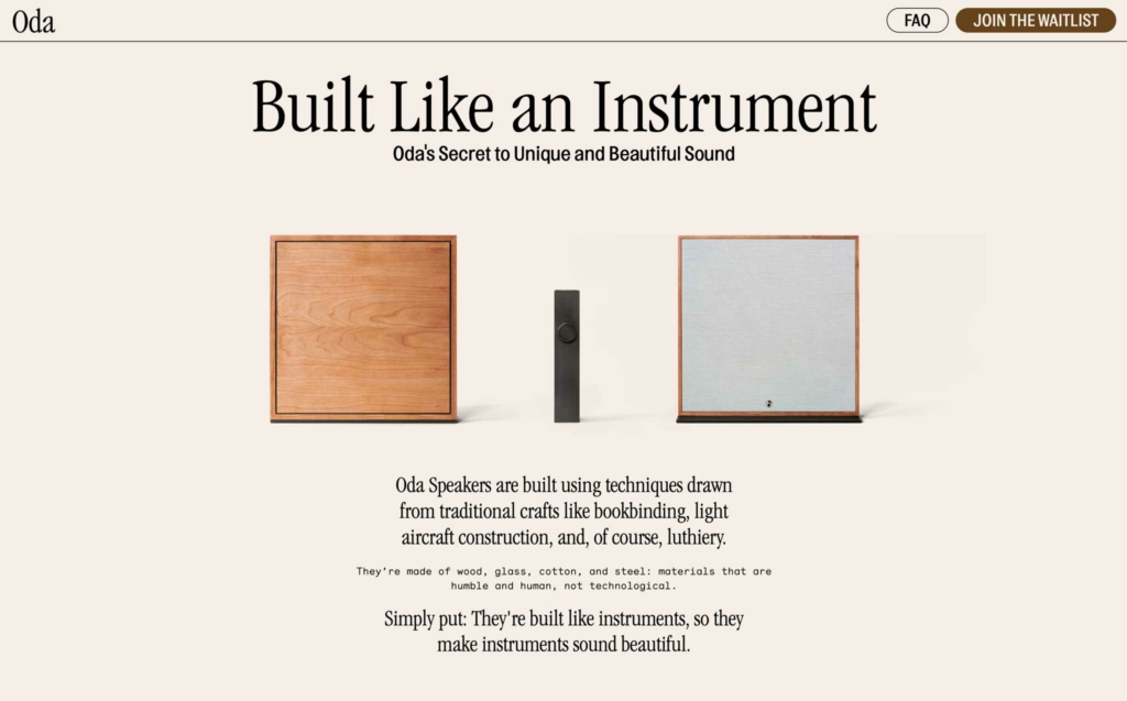
80s-style advertisement and the same narrow font on the website oda.co
The mush of the 90s is already quietly simmering, but it is a bit doubtful that it will reach the corporate mainstream. However, as an illustration, why not. The keywords are spontaneity, imperfection, blur, lomo photo, displacement, mixing, familiar textures from office equipment (copier, fax, printer, print screen surfaces, errors, etc.), pixel graphics, video and TV noise, glitch effects.
Today’s apps in a humorous nostalgia key: (mac)OStalgia.
Maximalism
An attitude that we don’t hold back, super-intense, tight, fast, big, exotic, ecstatic… Often street style graphics and layout. In topics such as food, entertainment, fashion, art, etc., where the experiences are intense.
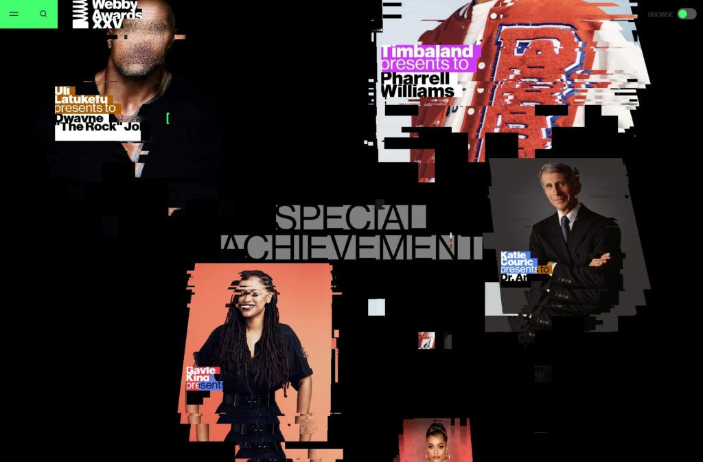
A few years ago, he kicked open the door of the corporate web, brought fresh air and now he has gone back to doing his art. Visual elements of this are now also used in consumer websites, but the fact that the robust nature, content or structure of the website is highlighted, and that the website can also be something other than a marketing channel, is seen in more experimental niche websites. If you need to restart and gather inspiration, see hoverstat.es.
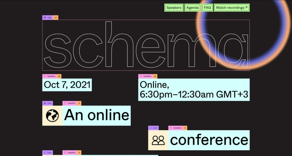
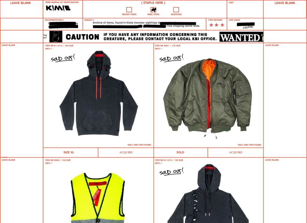
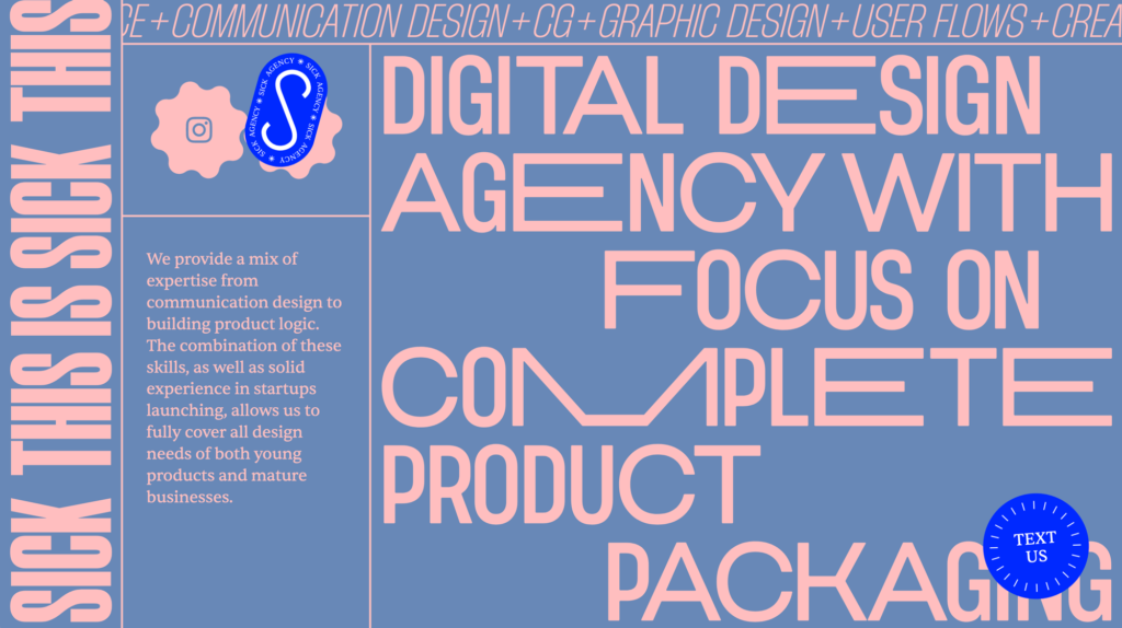
The content pieces are marked and the structure highlighted: schema.figma.com. The layout’s table-like structure is exposed at: kiwie.com. You can change the layout yourself by dragging with the mouse: sick.agency.
Corporate cute
The prevailing style in the entire digital world, social media and technology giants have also gone this way. Bright and friendly, soft shadows, plastic-toy 3D and, of course, lush rounded corners in recent years. With the help of algorithms, it reaches the spinal cord and triggers addictive waves of pleasure. Too often you come across childish Lego men with beards and manbuns.
Various visual techniques are used, for example, glass morphism is a kind of semi-transparent glass style. Claymorphism has forms like textureless and simplified 3D models. Both are primarily in illustrations. Clay can also have extreme rounded corners and a slightly bloated form like in a children’s interface – so it’s not quite suitable for everything, but appropriate in VR/AR environments with its physicality.
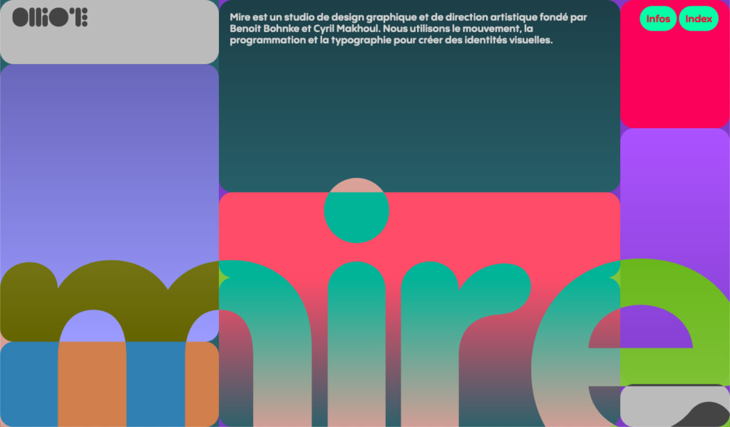
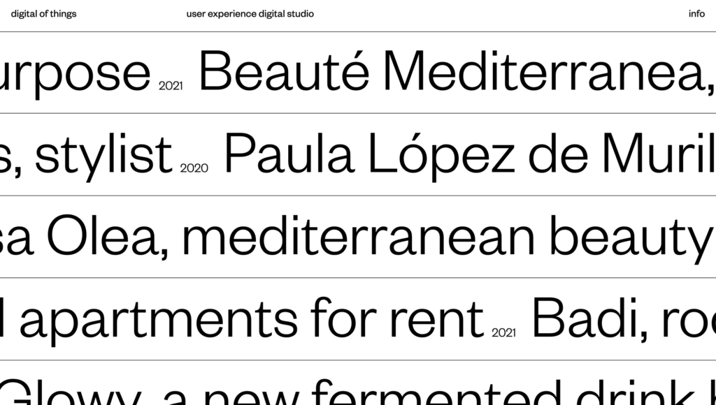
Trend reviews have talked about minimalism and big titles every year, so there has been no point in mentioning it, but now you can really see a lot of websites where large text is the main thing that gives the website its look.
At the same time, the palette of letters used is very diverse. Mainly, of course, block letters (geometric, grotesque), but also classic text letters with serifs, retro of the second half of the 20th century, earlier art deco, vintage, futu. And a concoction of all this in weird capital letters, which are then used extensively in headlines.
Narrow serif is very hot, the same can be said about monospaced serif, here are both together:
The font industry is booming, there are indie creators all over the world. The new and avant-garde is mostly born in old Europe, but Eastern Europe and South America, for example, also seem skilled. Let’s support domestic font technique!
On the technical side, there is already a common spread of variable fonts, which means that different sections are together in one light file. Fonts that also use different optical sizes will probably be coming – variants optimised for the respective use will be shown in the title and content text.
A common design technique is to combine different font types. A distinctive font draws attention and avoids monotony.
The natural development of the last several years has been the use of effects and micro-animations. They add a familiar feel of the physical world on the web.
But animation is used more and more to tell a story and apply branding. This trend is probably also supported by the popularity of 3D and, for example, the spot trend has probably extended its life partly due to the move to 3D and movement. The use of animation is also supported by better technical possibilities, simpler tools and technologies (eg LottieFiles) and the ever-increasing experience of the creators.
An interesting observation: because the limitations of movement made filming difficult, advertising turned to animation, so that there is now a boom in this field. Marketing is very interested in wacky animation for adults, à la “Rick and Morty” and “Midnight Gospel”. Read more.
It is a pleasure to note that the picture is diverse. If a few years ago the picture was still pretty uniform, you can now see a wider range of styles. Vector graphics, 3D, hand drawn – it’s all there.
In addition, illustration is no longer just something that is looked for in addition to content, but it is already a part of branding with its specific style.
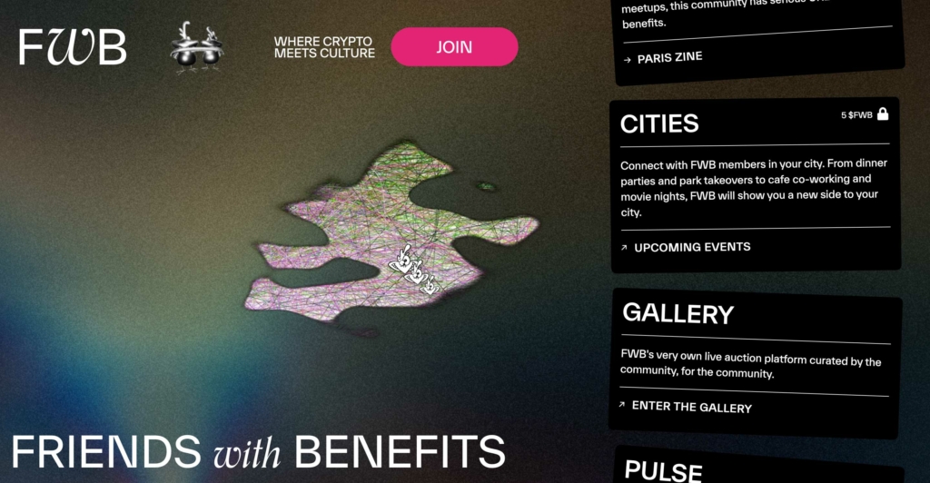
Animated amorphous blob moves with the mouse: fwb.help
In order to bring life into an otherwise vixen and decent corporate web, about 5 years ago, they started using a lot of spot techniques. This trend – to add something organic as an accent – has lived on and played out various possibilities from fun to weird.
3D and movement have breathed life into amorphous bubbles. This also carried over into typographic experiments, we saw sci-fi liquid metal fashion logos floating somewhere in dreamlike vapor-wave landscapes. We swing into the parallel vintage trend and trip in the LSD psychedelia of the 60s.
The 80s and Memphis continue to be hot with their abundance of colours, fun and irony: we see various abstract-geometric shapes that can be used between text blocks on the corporate web as well. The latter is also a trend in interior design, for example, because homes also need diversity, edginess and tricks, so as not to fade away quietly in age-old optimal minimalism.
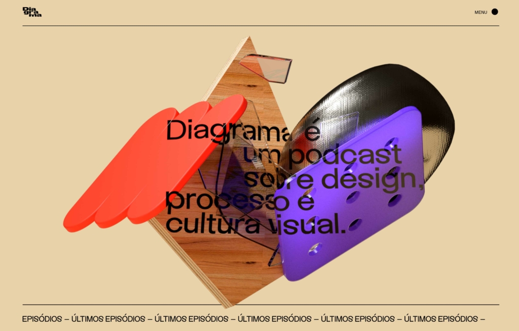
In addition to recognizable objects, some geometric objects: diagrama.co
Horizontal gallery bars
Decorative or illustrative pictorial strips of no significant value of their own, often added simply for variety. Mostly self-advancing, sometimes not even scrollable. Contain not many images at all – just a little more than the width of the computer screen can fit.
Scrolling text bars with a repeating word or phrase are still everywhere, even more so than before. As a frame and decoration, as a menu and content, as a background, as a banner. Vertically, horizontally, diagonally. Straight or crooked. Everything can be done.
Even the most ancient websites had a menu bar on the left side, and the submenu there is still common today. With the advent of phones, the vertical menu disappeared, because it cannot be shown on a narrow screen. For a while, the top menu also disappeared behind the hamburger button on large screens, but it reappeared again, because it is still considered a bad practice due to limited accessibility.
More and more, however, you can see that the menu is also moved to a list of links under the hamburger button on the big screen, plus there is a more detailed menu in the footer. And so not only on the fancy pages of design agencies, where for some reason it has been quite common all along (because blind people don’t seem to need design). By the way, the menu links do not have to be a strict list, they are also done in a more relaxed manner (https://notoriousnooch.co/ – Notorious Nooch)
As a new thing, I have noticed on developer blogs, a web app-style vertical menu on the left side. In the vertical menu, where all links and levels are visible at once, it is possible to move through the content very quickly.
In order to provide joy and colour in the gloomy and closed pandemic time, trendsetters in advertising and design are currently talking about cheerful, lively colours.
Of course, depends on the context and topic. In general, widespread web services are neutral light; cinema, sports, etc. adrenaline-providing dramatic dark; technical stuff in neons, things close to nature in pastels, etc. The accent colour of websites is still mostly determined by branding.
Pop is the syntheticness of the hologram. But on the other hand, also gentle colourful animated auras. They are also combined with a laconic beauty or with a small photo in the foreground.
When a few years ago there was fear in the air that AI would come and take over the work, now the new hype is no-code. This means that things can be done without developers. You can put up a website or launch an app yourself.
For example, it is predicted that in 2024, 80% of digital products and services will be built by people that are non-tech-professionals (see Gartner, Inc.).
What is the reason? Since digital technology is already irreplaceable and the corona crisis gave its usage even more momentum, the demand for digital solutions is high, but there is a huge shortage of developers. In Estonia, for example, at least 2,600 new ICT specialists would be needed every year, i.e. mainly developers, but also designers and managers (see OSKA study).
The share of the developer is also very large in the work processes. For example: a new website would be needed – but because the developer’s time is not available or it is too expensive, it will not be done and marketing and profit will suffer.
Another example. There is an old problem in web design that the design and development process are separate phases. Once the design is “drawn”, someone has to code it into a real web. Inevitably, there will be losses in the translation, the result will be different from what was planned, and the process will simply be inefficient, because the same thing will be done twice. That’s not normal.
No-code comes to the rescue
So what to do? Looks like the much-dreaded AI is up to some business of its own. Then you have to put your hands on it yourself and if you don’t know how to code, use the tools that have made the construction of the website graphical. That’s no-code.
Simply put, you draw boxes, enter content, connect to other web services if needed. Even if you are not a developer, today you can conceptually set up a digital product/service without touching the code.
Applications and solutions are constantly appearing, where a code writer is not needed to create digital products. For example, a web designer designs a web page, after which the app generates a real web page and puts it up for use. Or a marketer can put together a new landing page from pre-designed content blocks without spending designer and developer time. Or you create the appearance of the app in one app, connect to the database from another app and let’s go!
It’s kind of ironic that the demand for no-code experts and developers is also growing. In addition, no-code today is more suitable for creating smaller things and testing business ideas.
What are the disadvantages of no-code?
In order to do something bigger and better, obstacles may arise, including
You have to use different services to put together the right solution.
Each service has its own fixed cost, i.e. in the end, the developer’s salary can be cheaper and you would also have less burden.
You have to get to know each service, the learning curve can be long and difficult.
Each service has its own logic, limitations and fluctuations, which may not be suitable for your solution, i.e. it is difficult to make special solutions.
The solution is tied to specific service providers. If, for example, the service should stop working, your solution will also be closed. Often, the system and databases cannot be exported in order to set things up somewhere else.
But things are evolving, and even WordPress, for example, is using a no-code approach with its Gutenberg blocks, and Wix is currently promoting its design tool and Webflow competitor, Editor X.
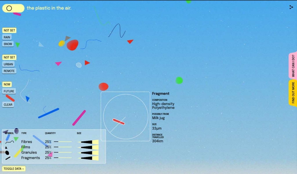
Eco-friendly web
The topic that came to the fore in the last couple of years seems to have receded, but let’s remind you.
So, the web and everything electronic needs energy to function – and not just a little. As the earth is therefore about to evaporate, it is high time to do something. What can a web owner do?
Web hosting has the largest ecological footprint. So, choose a service provider that uses green energy and you can immediately sleep more peacefully. Against the background of the current energy price shock, it is of course a difficult topic. It seems that none of the major Estonian web hosts talk about their energy use. Are our country’s websites running on old-fashioned smoking coal?
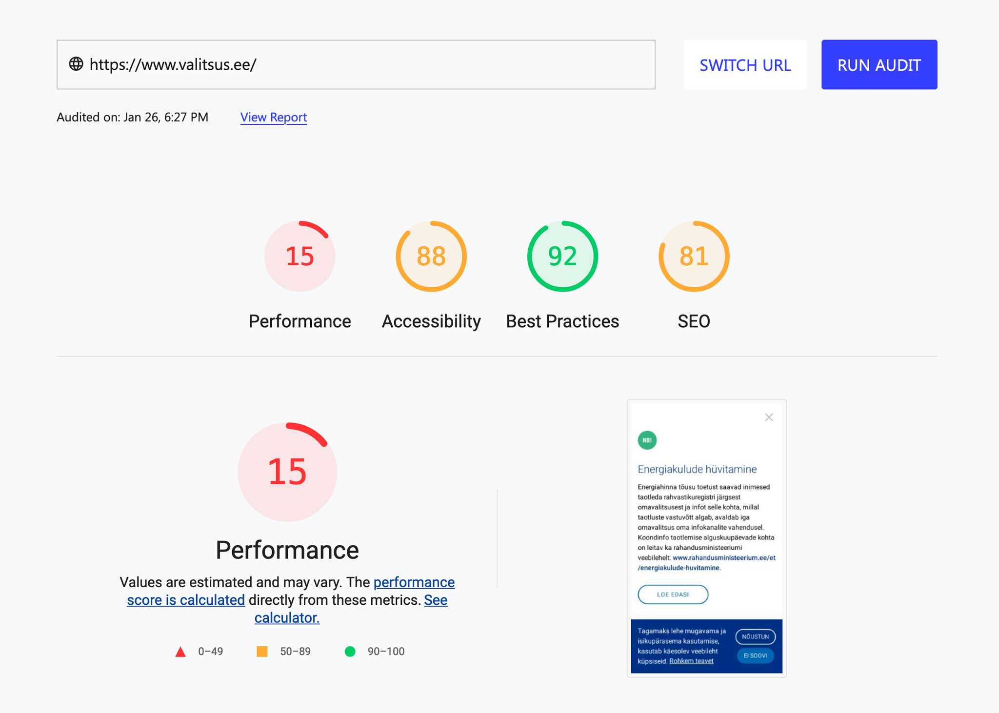
Website optimization is another important thing. A web that is lighter in terms of bits requires less energy to travel from the server to the user. Make your web images smaller than 200 kb and you’ve done a good deed! Moreover, since an optimised and faster web means user-friendliness and customer satisfaction, it is also potentially more profitable for the business owner.
As a random example, the Estonian government website gets a pretty weak result (15%) in the speed test. The test also shows areas for improvement: large images and unoptimized code are the main problems.
But let’s think further: is it necessary to store and display all this content on servers? And going to even more dangerous ground: is your service-product offered by your website environmentally friendly?
There is a lot of talk about this in digital design circles, and for example, we at Redwall follow accessibility standards by default when creating websites. But worldwide, so far, the development is not very noticeable. Supposedly, there is also a slight time difference at play here, the newer accessible websites have not yet become dominant.
The new standard includes new technologies and is not limited to online content.
Various health disorders are taken into account, not just vision problems.
The colour contrast algorithm is getting better. The current algorithm is mathematically nice, but some standard colour combinations, which should be easy to read, are difficult for the human eye. APCA takes context context into account. Contrast is calculated based on text characteristics (font thickness and size), colour (perceived brightness difference between text and background), and context (ambient light, surroundings, intended purpose of text). Want to try? Here’s an APCA contrast controller with an amazing design.
The assessment becomes more multi-layered and flexible. According to the current system, you either meet the standard or you don’t, and that sort of solves the issue. The new standard always shows areas for improvement.
The categories and readability of the standard are simplified. The tool itself should be usable itself!
Thus, the topic becomes even more complicated, if the field of work of specialists in the relevant field only expands.
It’s certainly a phrase that gets clicks, but is it something more? Although the matter is at a very early stage and there are many questions from every angle, some solutions probably have their place and the design world is keeping an eye on the topic, there would be a lot of work. As a side effect, the topic of virtual reality, which had been completely forgotten in the meantime, was pulled from the deepest depths.
Web design is not directly affected, but it is a culturally interesting phenomenon. It’s amazing to see that everything is ready to be chopped into tokens and played with: you want to earn by betting on court decisions – why not! I have to give credit, I couldn’t think of such a thing myself.
Web3 is reinventing the Internet
Hype, in the same direction as NFT, towards crypto and blockchain, but more broadly. Web3 preaches decentralisation. Quite rightly, the current situation where online services and people’s data are concentrated in the hands of greedy large corporations is considered wrong. It would be right for the entire ecosystem to be based on equality, and for everything from application code and database to money flow and personal data to be securely spread across the blockchain decentralised network. The idea is pretty well explained here.
Unfortunately, this concept has many fundamental problems, technical shortcomings and other issues, and it is far from ideal. The thing is financed by profit-oriented venture capitalists, the system is understood only by crypto-nerds, and the average user has no real control, there are no rules, because there is no central authority, the system is still very centralised, at least so far. And all this threatens to literally cook the earth in no time, if it should stay on the current crypto technology and spread into masses.
In addition to the objective problems, the tech-prominents also seem arrogant, so things are already sour. The idea is beautiful, right? But we’ll see what becomes of it.
How does all this relate to web design? Decentralised app (abbreviated dApp in English) is slightly different from the usual in terms of development, but the user-centred design is still the same. It has been written that the goal of the UX designer and writer is primarily to make the subject usable for the common man, to form a mental model.
Maybe it will lead to some new usage patterns or UI elements, but it is basically no different from selling some complex product, financial service or political program before the elections on the current web.
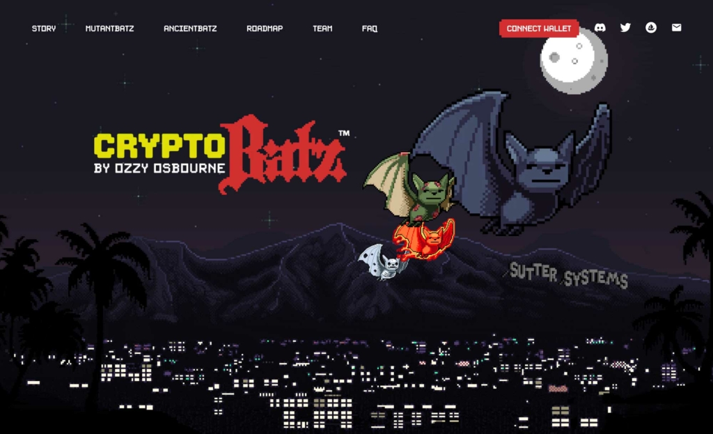
Well, maybe my mental model is not set yet, let’s follow the topic. Anyway, quite a lot of the coolest web design comes from crypto-themed websites, this is also noticeable in the examples of this article. As someone mentioned somewhere: web3 now seems to be just a cool new thing to do and actually shape yourself – like in the early days of the web era in the 90s.