World of web design has become quite colourful and fun. Just recently, the main standard for both designers and clients was Apple-like neat, clear and calm style and clinically clean matte-aluminium surfaces. But today, we see a very colourful palette. Of course, not all the following described trends will become our everyday life, but an overall course is still visible. Conventional design has become boring. The main goal is not so much beautiful as it is interesting and different.
Off-grid and mondrianism
As already mentioned in our last years overview: asymmetry, unusual layout and modularity. It is clearly a trend stream that gathers strength from new technological opportunities. Compared to, let’s say, few years ago, it is now become much easier to create entertaining layouts thanks to Flexbox and CSS Grid. Now, elements move around on the page, overlap and so on.
Or on the contrary, the layout can be very refined. Mondrianism is a type of layout that resembles the dutch painter Piet Mondrian’s works. Here, elements are not scattered but very strictly positioned in boxes of different sizes. Flat style resolves more complicated composition tasks. So far, mostly in designers’ sketches Dribble-shots, as in reality with changing content and on mobile this layout may prove difficult to control.
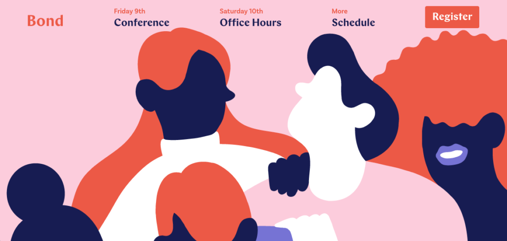
The diverse world of illustrations
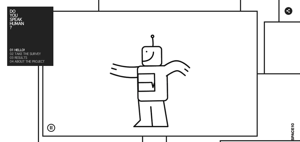
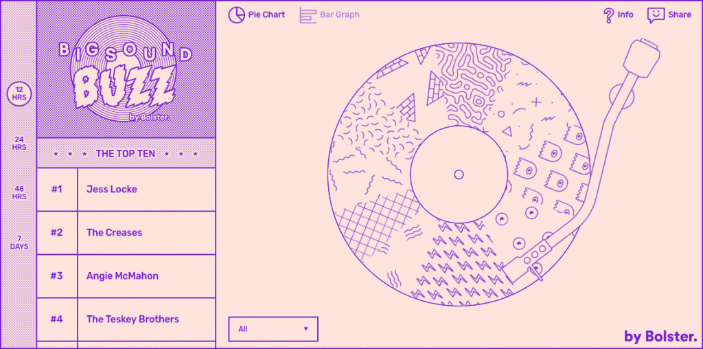
Illustrations are used more and more instead of photos. They are by nature more personalized and distinctive than photos that surround us everywhere. And we see richer graphically cognitive creations replacing more anonymous vector illustrations.
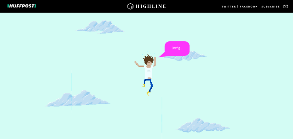
Effects and animation
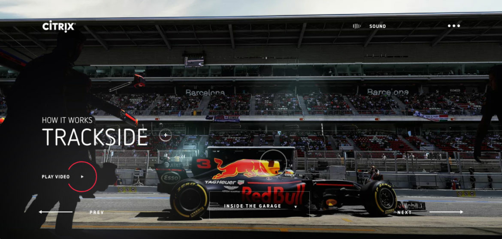
Scrolling is not the only way how a website can flow and move. A modern website is home to different graphic figures that flicker and move on thier own. Entertaining transitions from one page to another, effects masking and morphing geometry and photo material, micro animations etc are all possible thanks to technological advancements. Animations are used to illustrate substantive information such as product introduction or story-telling in investigative journalism.
Adventures on the trails of typography
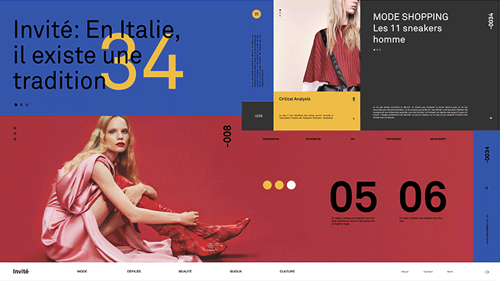
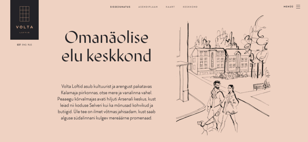
As said in our last years’ article, shique fonts with serifs are becoming ever more popular. The triumph of geometrical round shaped block font continues. Fonts with a twist of grotesque offer some variation. But surprisingly, even more on-the-edge typography is raising its head, and not only in portfolio webs of designers. An example form Estonia: a website for the wider public that uses quite distinctive heading font. Notice the usage of trendy illustrations and interesting colour palette? Awesome job, guys!
Some news from technology side. OpenType Variable Font is a standard that enables using multiple font cuts and styles in one font file. And it’s possible to control and animate these features in code. It means that websites will become quicker and typography can be adjusted according to devices. It also opens new opportunities in ways of creativity. At the time of writing this article, this technology is supported by Firefox and Chrome. Soon Edge and Safari will comply.
There are also parametric fonts that can be influenced in real time and its characteristics may depend on external information flow, such as weather, location or the volume of cat videos the user has watched. Imagine the font-madness that could result from this freedom!
Experimenting with colour
It was some few years ago that intensive colours and colour gradients made their way into web design. The trend lasts and is gaining momentum. Once avantgarde IK Blue is pretty much mainstream now, if not coated with even more intense neon colours.
But a parallel trend are softer colours, yet surprising tones and combinations. Main colours are shifted towards fractured shades. It’s like a mature and sophisticated vintage feeling progressive music room in a hectic rave club.
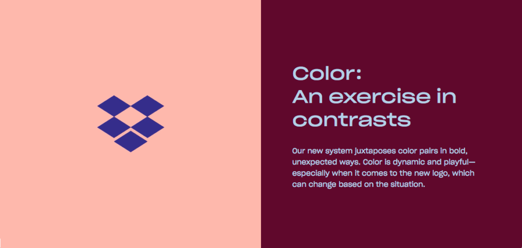
But a very confined colour palette style is also represented. Some even monochrome or black and white.
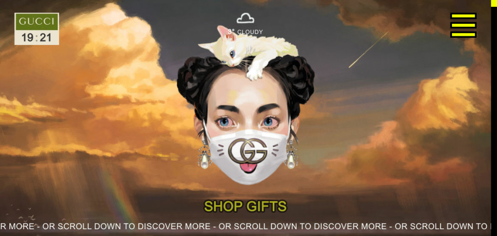
Organic forms
One of the wittiest design overviews I red in 2017 was an article headed “2017: The Year of the Blob”. It’s true, various amoeba-like characters can still be found performing different functions. Among them is our own Estonian massive design and PR faux pas named “Boulders”. An earlier and more known example in Estonia is Telia’s “Easter egg”.
Blob belongs to a general current that tries to oppose to dominant flat style by reviving design with various wavy, crooked and diagonal forms. The attempt toward more organic forms includes the fact that round corners are back (Twitter UI remake). Unlike the former toy-like round style of Web 2.0, the trend is now more mature and modest.
Immersive gripping environments
Web environments using 3D made with WebGL technology are becoming more common. These achieve a computer game like user experience and thorough investment in the storyline.
Mediums that are immersive are almost an everyday occurrence in the web. But 360° video and virtual reality are still resource demanding and expensive. Not to mention, often inconvenient to use. Since phones now support respective technologies, augmented reality will probably be the new fenzy this year, especially in phone apps. It’s not as labour-intensive and offers loads of various possibilities of use.
Voice controlled devices are trending as well. We’ll see in a few years, how much will the development of voice interface influence web design. For example, the chatbot mania last year hasn’t left considerable mark in web design.
Brutalism
Brutalism is a style, or to be more precise, an attitude, that came out to the wider public in 2017, although it existed in avantgarde for years. In architecture, brutalism means extra modernist robust concrete or brick colosseums without any embellishments. Construction and raw functionality are not hidden from view.
And so it is also in web design: brutality, refined, maniacal, egocentricity. But here we can also find a good dose of modern unfinished, temporary and sarcastic feel. To add to that, self-irony and parody on the subject of web design history, contempt toward the frivolity of mainstream design and all kinds of trash and camp.
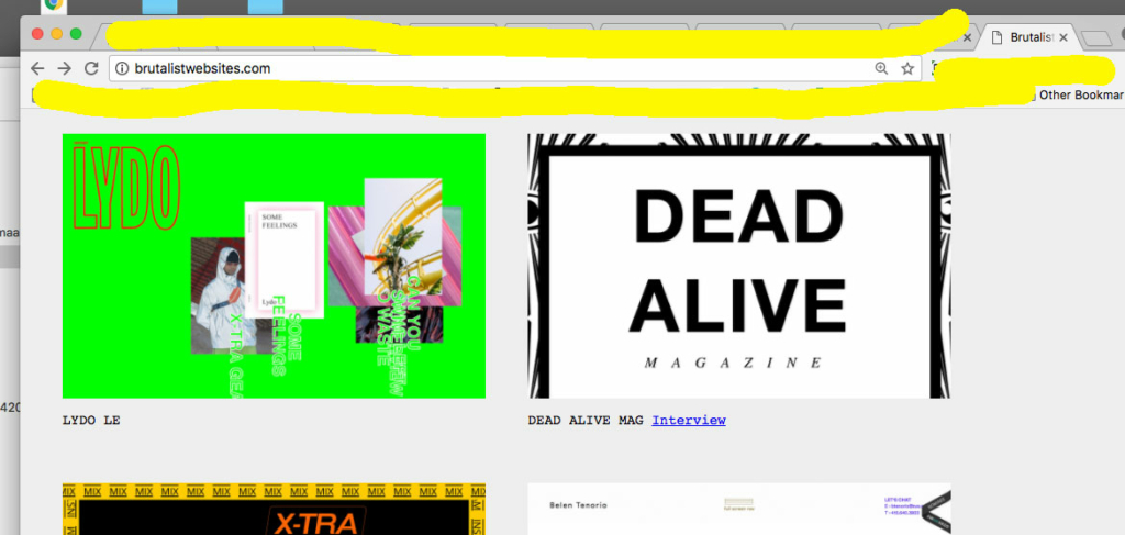
It’s questionable if brutalism actually makes its way to mainstream. It will most probably remain an ironic metagame and avantgarde of designers. They are experiments with trippy egocentric parallel realities, where user experience and reasonableness is the last thing on designers’ mind. But as you can see, some bigger fashion brands have already hijacked the trend.
Fascinating present and future
We’ll see, how web design will be influenced by AI and automation, new design programmes and work processes, evolving business and technology environment. And of course, the growing dangers involving cyber security and overall societal frenzies.
Modernize Your website!
- Test, whether Your website loads quickly or leaves visitors on hold?
- Some inspiration in the form of a pick from an honorable jury: CSS Design Awards: https://www.cssdesignawards.com/woty2017
- Contact us, we’ll help You with design, development and content!