Webs and apps are increasingly similar
Everything from boot brushes to home loans are sold with the same look. Not only are logos becoming more and more similar and generic, so are websites and apps. The apps in particular look very similar – white background, lots of empty space, little text, texts and logos in geometric sans-serif font, no design elements that distinguish it from other apps.
On the one hand, this is good: the simpler and more familiar the web or app is, the faster the user can get things done. No need to figure out how to navigate or do anything – everything works the same everywhere.
The downside, of course, is that the predictability is boring and nothing stands out.
It is also negative that if everything is made very easy for the user, then they are not really left with choice and decision-making power. The digital world tends more and more to the dictatorship of choice by default, and here already questions about monopoly and the like arise. It already concerns the real world, someone’s ability to cope when everything is concentrated in the hands of a couple of big players and the little ones disappear. This problem has become especially acutely visible in the case of voice devices, where it is already difficult to offer multiple choices due to the peculiarities of the voice medium.
Content is important
As the designer’s tools and processes have become very accessible and beautiful designs can be found by the hundreds, content becomes more and more important. What do you offer? What do you want to say? How do you stand out when you look like dozens of your competitors? What value does your service or product really offer to the user/client?
Therefore, more and more people are talking about the skill and importance of writing texts in digital products. And more broadly about storytelling. A good video also starts with a good script, even if there are no words spoken. Make your point as easy as possible for a web surfer with an attention-deficit to understand, while adding a touch of your own personality.
This concerns not only the introduction of the product-service, but also the comprehensibility of the interface: the texts of the buttons, the comprehensibility of messages, the entire user’s contact and movement with the digital environment. Mikro-copy has already been talked about for the last few years, but you could try to think of the whole web/app as a story that resonates with the listener and invites them along.
The illustration rocks
It has been predicted for years that video and illustration will soon become irreplaceable in web design. In 2018, the photo became obsolete and the illustration forcefully took its place, and apparently this trend will only continue. A good illustration is labour-intensive and time-consuming, but it definitely sets you apart from your competitors.
Some clearer directions can be distinguished in the illustration:
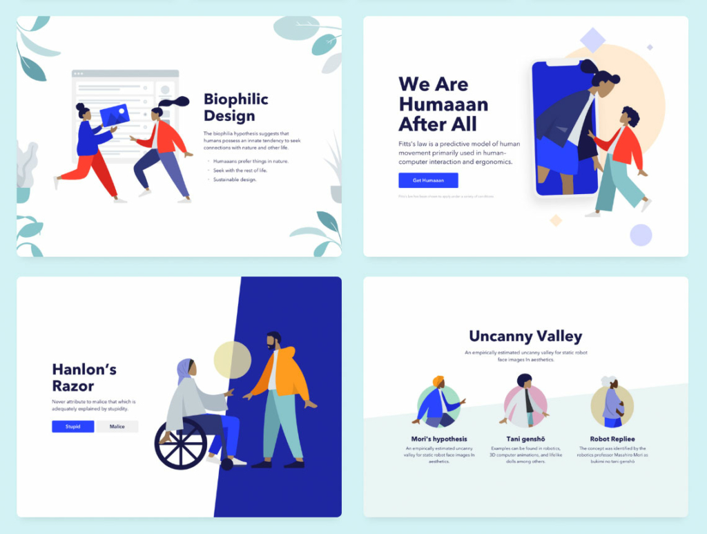
Laconic style
This style is based on 1960s psychedelia. Characteristics are clean, large colour surfaces and a simplified way of representation. Unfortunately, this style can already be seen too much. The reason is that it is relatively easy to make. Since the style is so common, there are already even illustration generators – which means that in the new year all places will probably already be full of such stiletto-legged, faceless characters.
Classic style
It’s a more unique, richer and therefore more memorable style that not every web designer can do. There are actually many different techniques, styles, feelings, emotions here.
For example, Mailchimp, which has undergone a style update, uses a drawing style. Intercom is collage-like and downright avant-garde. Sometimes it is surprising how open-minded the clients of such websites are, without being stuck in a solidly combed corporate style. It still depends on the field. Although, for example, Mailchimp would not have offered such a melancholic world in a slightly schizophrenic handwriting.
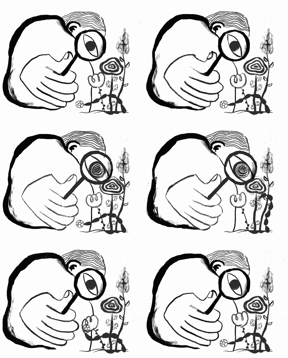
The retro-inspired isometric style and the Memphis/postmodernist style have also been around for a long time.
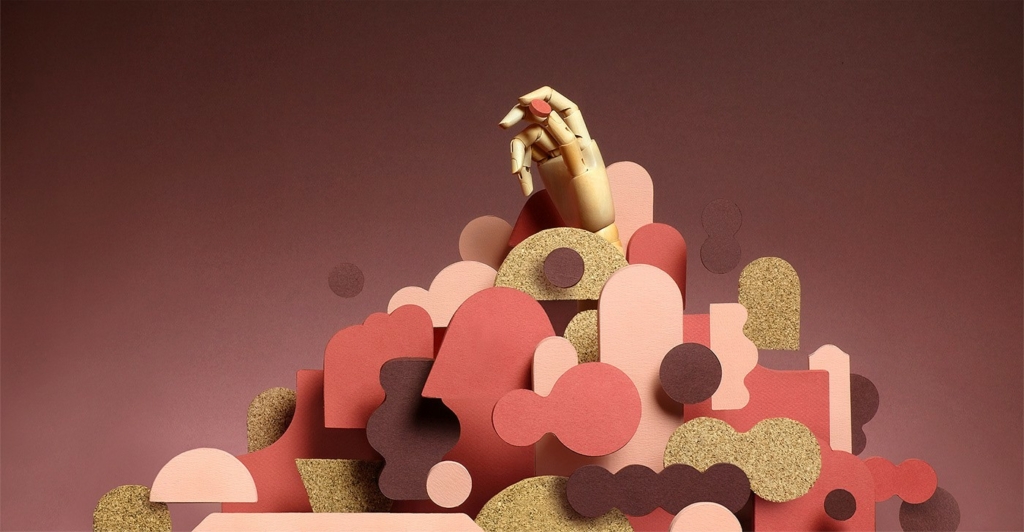
3D
The style of 3D illustrations with its sci-fi abstract, peaceful and deserted worlds has spread from animation studios. Recently, people also appear in these 3D worlds, as can be read.
3D, AR, voice devices
From 3D illustration, it’s good to move on to a more general 3D theme. Already last year, it was clear that families would not start sitting in 3D masks, as predicted. AR (Augmented Reality), which combines 3D and reality, is more human-friendly and practical. It hasn’t existed experimentally for a year or two, and it largely remains a niche technology, but we will probably see more and more different augmented reality solutions. Real physical stores, museums-exhibitions, public buildings, nature parks, etc. get one layer of information, e-stores and games bring objects and characters between the walls of the home.
Augmented reality is boosted by the fact that smart devices support the 3D file format, that there are 3D posts on Facebook, that FB is also developing AR glasses. There are easy tools to create 3D/AR content: Vectary and Torch, Adobe Aero is coming soon. Apple ARkit 2 and Google AR Core allow augmented reality to be created and displayed on devices.
Audio devices are also something that exist, but they haven’t changed the world. Of course, the obstacle for us in Estonia is that these devices do not yet support the Estonian language. But we’ll wait and see. Designers, of course, have completely new perspectives on how to design the user experience in voice devices. And from here on, where is the user interface at all, if you control things with the so-called power of thought?
The colours are cheerful and soft
Next to the stingy blue and purple gradients of the synthetic-looking feeling of recent years, more and more calm colour palettes are seen, where calmer natural and natural tones and textures prevail. Monochrome colour schemes are also often seen.
Guess it can be said that another major change is gradually taking place in the world of colour. So far, Apple reigns supreme in product design, imitating Braun’s German matte-grey minimalism. Alongside it, Google has revived the soft and colourful Italian design of the 60s. Rational apparatus aesthetics are replaced by joy of life and sensuality. Italian retro design has even reached the product design of practical and hidden pieces of technology.
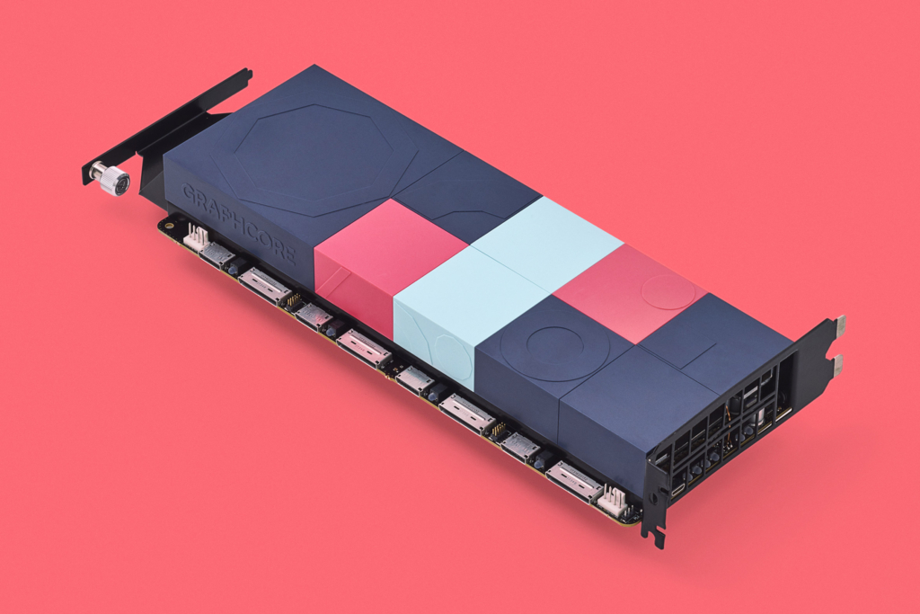
Observations of Pantone colour specialists also show a mild trend. Pantone’s colour of the year 2019 is energetic, but human-friendly coral red (PANTONE 16-1546 Living Coral). Does it look familiar from the Airbnb logo?

However, the image bank iStock has noticed that “Z-gen yellow” is popular in searches and the fashion world also promoted it last year. It is also a joyful and energetic colour.
In the world of product design, of course, the future is already being planned further than next year.
Turn off the light…
This autumn’s hype was dark mode, i.e. dark UI, night mode user interface, dark mode. Many work programs have had a dark interface that saves the eyes for a long time. It’s a recent topic in apps that the app’s colour scheme takes into account the time of day or the real light environment and adjusts the colour scheme accordingly. In the dark, the app has a black background and light text, in light, the opposite. For example, on Wikipedia, you can dim the darkness very finely yourself:
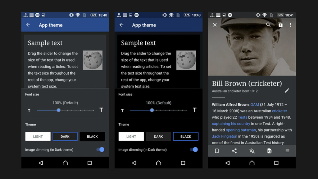
Mac’s latest operating system, Mojave, now also came with the option to choose either light or dark mode, and of course, this especially turned on the hipster designers. Soon you will be able to calmly scroll through social media while sitting in the cinema.
Night mode also has a technical rationale. OLED screens on phones actually save energy and battery when the picture is dark. That’s an argument for phones, of course.
Some bolder predict that the future is dark, also on the web. Personally, I doubt it, because colors in a black environment, including pictures, are sometimes a rather difficult combination. You can’t just flip the colors around, it still needs planning and extra work.
The biggest flaw in my opinion is that the dark background has its own strong cultural background. Where appropriate, the webs are already dark (luxury, mysticism and all kinds of dark topics, nightlife, sex, games, cinema). It doesn’t make sense to turn everything dull black, everything shouldn’t depend only on the surrounding light conditions.
Various typography
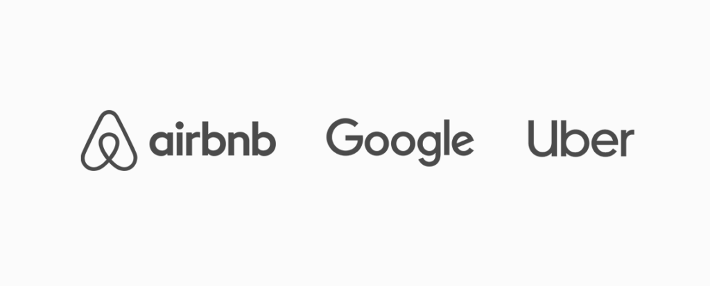
You can see a lot of different and cool font solutions, but the geometric friendly sans-serif is still everywhere. Even the logos thus become very similar: see example above (Google, Uber, Airbnb).
Robust grotesque letters are also very popular. The broad cuts of this genre, laid out in capital letters, are quite a recent hit. Popular fonts are Druk, GT America, etc. It is also very suitable for creating a corporate website.
In fashion and beauty topics, we have already seen flexible serif fonts in the last couple of years. Retro moods always have their place in these topics.
Where to next? The Brutalism trend permeates mainstream experimental writing systems. For example, outlined titles have now reached the mainstream with a lag of several years. The letters themselves have many scales of change to play with, so we’ll see. Reverse contrast font, anyone?
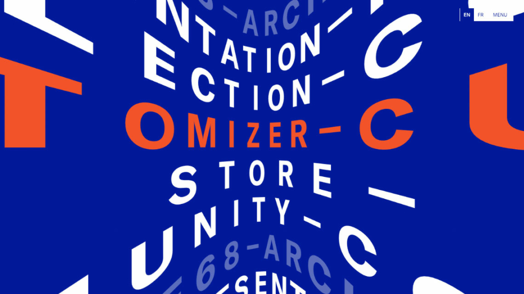
A separate trend on the web is moving texts and using texts in 3D in addition to the usual 2D:
Effects and animation
Today, we are in a state where imagination is the limit and we’re using the device’s graphic capacity to the max. In addition to 3D effects, we see, for example, graphics morphing, masking, liquid effects, etc.
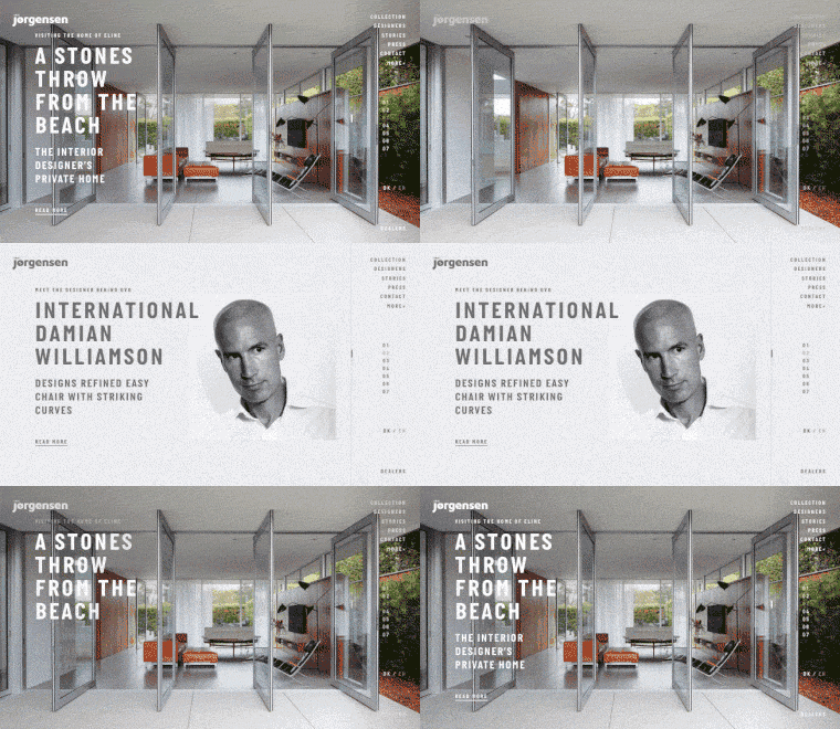
Animations have also evolved to be very diverse, so no one big trend can be singled out. Micro-animations, transitions, animated icons and illustrations, animated stories, and of course the good old parallax effect – all this is seen more and more.
Smooth transitions when there is no visible new page loading are nice. Scrolling effects and mouse cursor games can be seen. Horizontal scrolling is again more honored, it’s just done technically better and more thoughtfully.
Here is a collection of effective websites from 2018.
The life of a designer
Tools
The trend is towards tools that bring the designer and the developer closer together. So that the developer does not have to start recreating the design in the code, it would be smart to import the design element immediately as code.
Code snippets that work can be automatically exported to development via the Figma API and Sketch plugins already today. Framer X merges the design and coding phase in probably the most unambiguous way today. Supernova Studio allows you to assemble a finished app from a Sketch design file. Literally promising applications that are still in development are Modulz, Phase, Interplay, Hadron, etc.
The next step is that a ready-made app is automatically generated from quickly drawn drawings, and all that is left to do for people is to present it in the meeting room. Okay, it won’t happen right away, but Uizard promises to generate design pieces-code snippets, and about a similar thing to Airbnb we actually covered in our last year’s review article.
Work ethics
In the field of user experience, there is a trend towards more responsible products and services. The only goal should not be to keep users on our app or website as often and as long as possible at any cost. Creating addiction and taking over people’s private lives is not ethical.
This is also related to the topic of dark patterns, various dishonest manipulative techniques to get the user to click something, become a user, etc. If the client or the management does not see beyond the short-term benefit, the designer still has the moral duty and the right to say “stop”.
For example, today I have had this macOS notification sitting in the corner of the screen again for a while, and there is no Cancel or Later option to get rid of it (Details takes me to the App Store). It doesn’t make you feel good, it’s annoying, so what does it actually achieve? Even if it is not malice, it is carelessness. Shame!

State of development
A colleague recently shared a pretty good infographic about what technologies have been used in web development through the ages and what the future holds. Instead of clumsy and often insecure large CMSs, static websites that are fast and secure are popular today. But they are still difficult to manage, which is why WordPress, Joomla, etc. still rule. And for the future, of course, a familiar theme is promised: robots will come and take our jobs.
Paradoxically, while computers are getting faster, code is getting clumsier. One reason is that the web is often overloaded with ostentatious pointless effects and images. Another problem is the cult of rapid development (lean, agile, etc.), the fragmentation of the development process and the resulting convenience and carelessness have made the code massive and inefficient. The hope is that users’ fast devices can run the thing.
Technologies that would eliminate the differences between different platforms are slow to become a reality. The concept of web components is slowly advancing. For a few years, PWAs (Progressive Web Apps, i.e. technology between a website and an app, which is fast, convenient and works even without an internet connection) have been promoted and encouraged, but for developers, only native apps, web apps and simple websites are still on the radar. Maybe 2019 is the year of PWA? Perhaps UX designers also have a role to play here, who would be able to see more in PWAs than the possibility to send notifications (which is currently being done excessively and thoughtlessly, anyway)?
But otherwise, the life of a developer is exciting, here is a small overview of what was important in 2018.
The healthy absurdity of life
All in all, 2018 was a slightly lighter follow-up to the tumultuous 2017. 2019 will probably be even calmer or, on the contrary, some new technology will finally go to the masses with great speed.
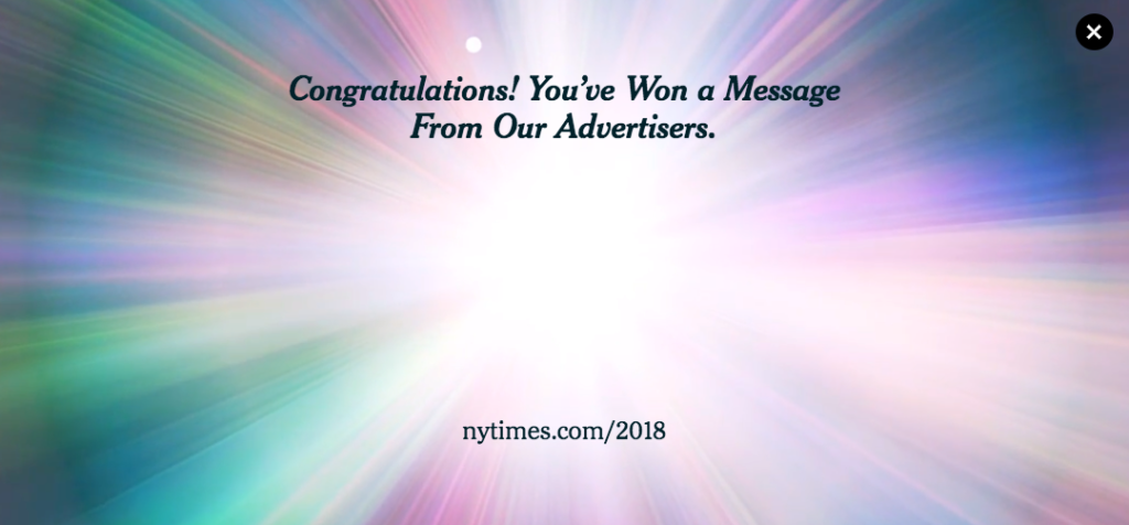
It is good to see that brutalism and avant-garde monstrous design, which also brought healthy irony, fun, creativity, anti-corporatism, ugliness and sense of absurdity to web design, keep their eccentric line and criticise the well-trodden paths in design and the wider social discussion tending to idiocy. Especially in the field of art, music and fashion, but also, for example, in the media:
Happy New Year!,
Update your website!
- Test whether your website loads quickly or makes the user wait longer?
- Get in touch, we can help with design, development and content creation.
